Sunday, December 18, 2011

Comic Cover Critique Part 3


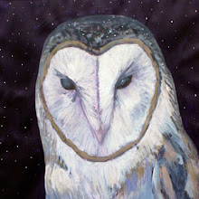
Massimo Carnevale is one of the best cover artists currently, and what I appreciate about his work, apart from his amazing painting skills, is the constant innovation on composition and approach. Each story arch he does something a bit different. I'm actually not certain if he does the graphic design as well but on "The Plague Widow" arch they put the title on the side which might be a bad decision, but works well with the composition and with the distinctive look of the book, I bet no one had a hard time finding the book on the shelves.

Carnevale has a great grasp on using blacks and white effectively and an eye for symbolism and details like the skeleton fish. His images make you intrigued about the story and into the mood of the book.

Comic Cover Critique Part 2


Yesterday I was critical of Jim Lee's Justice League cover, and to balance that here's the cover for Uncanny X-Men 275. This cover has had a huge impact on me - when I saw it, I was reading the Finnish reprints of Uncanny X-Men which were almost a hundred issues behind, but upon seeing this cover, I was so intrigued of the weird changes to the usual look of X-Men that I started reading the English Uncanny X-Men starting as well, and for a 13-year old Claremont's prosaic language was great for learning the language.

The three-fold cover has a well-thought symmetric composition, the white background is effective with the complementary yellows in the costumes and the purple of the side characters. Gritty but monumental!

Saturday, December 17, 2011

Comic Cover Critique Part 1


Jim Lee is a wonderful artist, and though he is appreciated for his dynamic depiction of superheroes, he also can infuse his drawings with atmosphere, but not in this case. The cover for the first issue of Justice League tries to deliver on the iconic level and the composition aims to be dynamic: characters come towards the viewer, the colors try to be vibrant and the different colors of energies and general razzle-dazzle aims to be electrifying and youthful.

But the flag-ship of DC's re-launch lacks a message and a point of view - it fails to promise anything new or interesting to either old or new fans. At least to me it's a dull, generic marketing image with the iconic heroes stripped of their personality. And what does the Green Lantern's "cock" is tell of the maturity-level of the image?

I suppose it is the difficulty of a first issue cover for a team book when the image has to introduce all the players, but in my opinion Lee did a more impactful job on his covers for X-Men and Uncanny X-Men.

Friday, December 2, 2011

Brought to Light


Brought to Light: Thirty Years of Drug Smuggling, Arms Deals, and Covert Action published originally by Eclipse Comics in 1988 collected two stories, the more notable being the collaboration of Alan Moore and Bill Sienkiewicz titled Shadowplay: The Secret Team. It covers the history of the Central Intelligence Agency and its controversial involvement in the Vietnam War, the Iran-Contra affair, and its relationship with figures like Augusto Pinochet and Manuel Noriega. It's basically just an anthropomorpich character spilling his guts on what actually happened. The art by Sienkiewicz is wonderfully wacky and experimental and makes the monologue into a mind-blowing reading experience.

Vampyres by Bill Sienkiewicz


In 1985 Blackthorne Publishing released a portfolio of images titled Vampyres, with black-and white images by the great Bill Sienkiewicz.